When you see a standard QR code, you usually see a black-and-white pattern inside a solid white box. Creating a QR code with a transparent background simply means getting rid of that white box. This small change makes a huge difference, allowing the code to sit cleanly on any background, color, or image you want.
Suddenly, a purely functional tool becomes a sleek part of your design. It stops being a clunky sticker and starts integrating seamlessly with your brand’s look on product labels, websites, and business cards.
Why Transparent QR Codes Are a Game-Changer for Your Designs
Have you ever designed a beautiful product package or a minimalist business card, only to have the whole aesthetic ruined by a big white square slapped on it? That’s the classic QR code problem. It works, sure, but it often sticks out like a sore thumb.
A QR code with a transparent background is the solution. It lets your design breathe by blending right in, making it look intentional and professional.
This isn’t just about aesthetics; it’s about brand integrity. Your color schemes, imagery, and overall visual identity should be the main event. A transparent QR code supports that vision instead of competing with it, ensuring every piece of marketing material looks polished and cohesive.
Unlocking True Creative Freedom
Once you remove that restrictive white box, your design possibilities open up significantly. Think about placing a QR code subtly over a product photo in a magazine ad, or on a clear window decal without an ugly border. That’s the kind of flexibility modern branding needs.
Here are a few real-world examples where transparency makes all the difference:
- Product Packaging: The code can sit directly on your box or bottle, letting the product’s own color and texture show through. It feels like it belongs there, not like it was added at the last minute.
- Apparel: Printing a transparent QR code on a t-shirt means it merges with the fabric’s color. No awkward white patch, just a clean design.
- Marketing Materials: On brochures, posters, or digital banners, the code can overlay complex images and patterns without clashing. The result is a more harmonious and eye-catching design.
The biggest win here is perception. A well-integrated QR code feels less like a pushy ad and more like a helpful, native part of the experience. It sparks curiosity instead of demanding attention.
The Growing Need for Smarter Design
QR codes aren’t going anywhere. In fact, their usage is exploding. The global QR code market is expected to hit roughly $13.04 billion by 2025, with an active user base of over 2.2 billion people.
With so many codes out there, yours needs to look good to get noticed. Making your QR codes transparent is a simple but powerful step to ensure your brand appears modern, thoughtful, and professional in a very crowded space. If you’re interested in the data, you can discover more insights about QR code industry growth.
How to Create a QR Code with a Transparent Background
Making a QR code with a transparent background is easier than it sounds, especially with the right tool. The goal is to remove the solid background, leaving only the scannable pattern that can be placed over any design.
Step-by-Step Guide using OpenQR
OpenQR is a free tool that simplifies this process down to a few clicks. It gives you full control over your QR code’s appearance without needing any design software.
Here’s how to create your transparent QR code:

- Enter Your Data: Go to OpenQR and input the URL, text, or other information you want the QR code to link to.
- Open the Design Panel: Look for the design or customization options. This is where you’ll control the colors and style.
- Set the Background to Transparent: In the color settings, find the option for the background. Instead of picking a color, simply check the box labeled “Use transparent background.”
- Choose a Foreground Color: Select a color for the QR code’s pattern itself. Crucially, this color must have high contrast with the surface where you plan to place the code. A black or dark-colored pattern is safest for light backgrounds.
- Download as a PNG File: This is the most important step. To preserve the transparency, you must download your QR code as a PNG file. JPG files do not support transparent backgrounds and will add a white box back in.
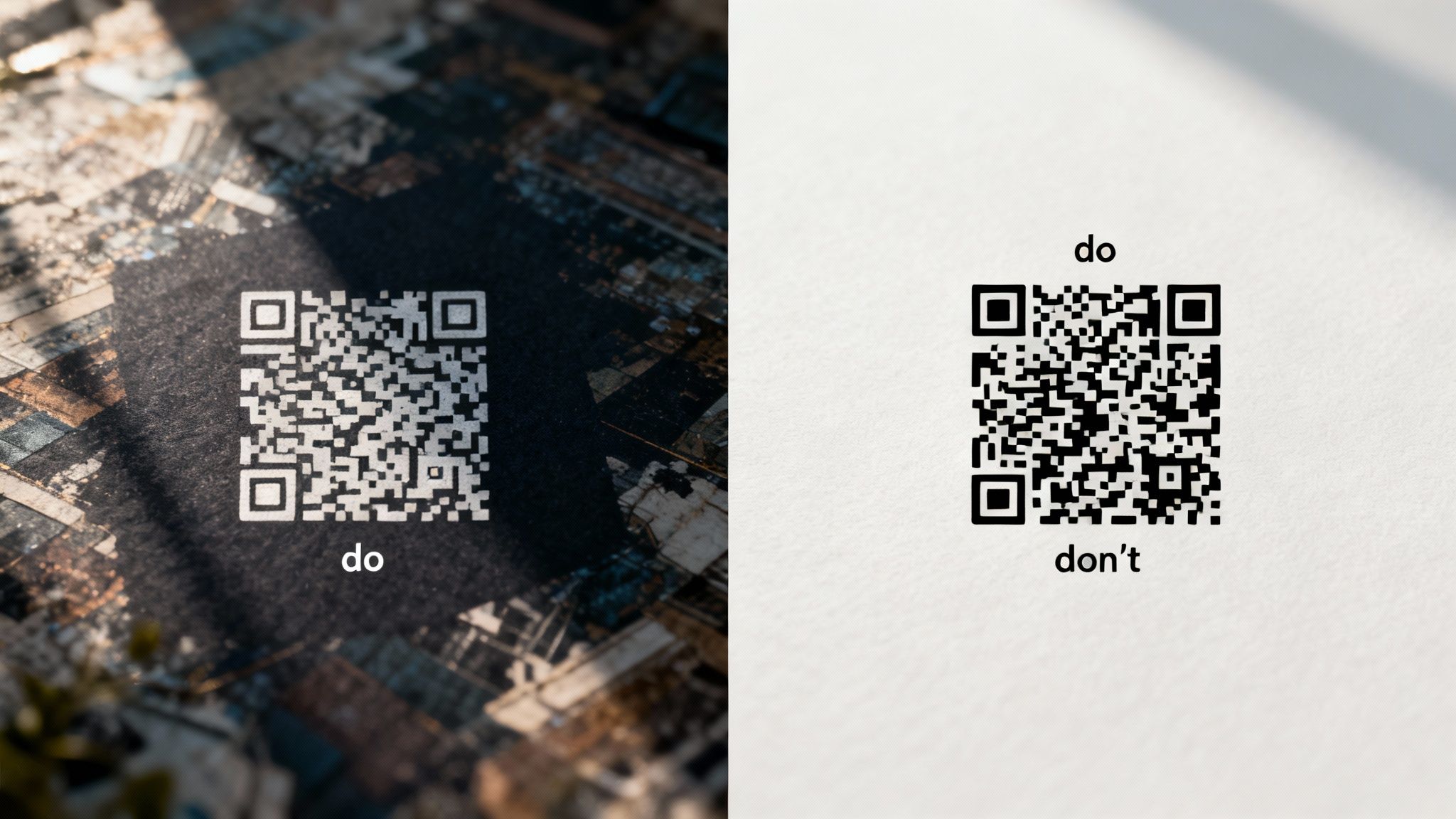
This image really shows the difference between a standard QR code and one with a transparent background. You can see how cleanly it integrates.
It’s a perfect example of how removing that solid background lets the QR code become part of the design instead of just sitting on top of it.
Choosing the Right File Format and Settings
After you’ve styled your code, the next step is downloading it. This is a big one. For transparency to work, you absolutely have to choose PNG. JPG files don’t support transparent layers, so if you download a JPG, you’ll end up with a solid white background again. A PNG file preserves that background-free setting, giving you a clean asset ready for any project.
By the way, if you want to take branding a step further, OpenQR also lets you pop a logo right in the middle. We have a whole guide on creating a QR code with a logo that walks you through it.
One setting I always tell people to pay attention to is error correction. If you crank this up, the code can still be scanned even if a part of it is covered or hard to read. It’s a lifesaver when you’re placing a transparent code over a busy image.
Real-World Use Cases for Transparent QR Codes
You’ve designed a sleek QR code with a transparent background, and now the real fun begins. The magic happens when you move that code from a design file onto a physical product or a digital ad. It just blends in, looking like it was always meant to be there. This seamless integration is where a transparent QR code really outshines its clunky, boxed-in cousin.

Here’s where transparent QR codes are most effective:
- Storefront Windows and Doors: A transparent QR code on a glass door looks clean and professional, allowing customers to scan for menus or store hours without a bulky sticker blocking the view.
- Product Packaging: Place a QR code directly on bottles, boxes, or labels. The package’s own color and texture become the background, making the code an integral part of the branding.
- T-shirts and Apparel: Print a code on a t-shirt without an ugly white square. The QR code pattern merges with the fabric color, becoming a seamless part of the graphic design.
- Restaurant Menus: On a beautifully designed menu card, a transparent code can overlay a subtle texture or color without a distracting white box, guiding diners to an online menu or payment portal.
- Video Overlays: Add a scannable QR code to the corner of a promotional video. It provides a non-intrusive call-to-action that viewers can scan directly from their screens.
- Business Cards: Integrate a QR code smoothly into a card with a unique texture, color, or minimalist aesthetic.
In each of these situations, the goal is the same: make the QR code feel intentional and integrated, not like an afterthought. If you’re looking for more inspiration, you can explore a real-world example of QR code implementation to see how another business pulls it off.
The Dangers of Using Transparent QR Codes
Here’s the catch. For all their design flexibility, transparent QR codes come with one major risk: poor scannability. A beautiful QR code that doesn’t scan is useless. The single most common point of failure is a lack of contrast between the code itself and the surface it’s placed on.
The Main Dangers:
- Low Contrast: A dark QR code on a dark, textured, or busy background is basically invisible to a smartphone camera. Similarly, a light-colored code on a light background will fail. The scanner needs a clear distinction between the code’s modules and the background.
- Complex Backgrounds: Placing a transparent code over a photograph or a complex pattern can confuse the scanner’s algorithm. The background “noise” interferes with the code’s data, leading to scan failures.
- Ignoring the “Quiet Zone”: Every QR code needs a clear margin around it (the quiet zone). With transparent codes, it’s easy to let background elements bleed into this space, which will prevent the code from being recognized.
A beautiful QR code that doesn’t scan is just a decoration. Always prioritize function over form by testing your code against its final background before you even think about a full production run.
This is critical for anything you’re printing. Colors and textures can look completely different on paper than they do on your monitor. To get reliable results, you need to follow best practices for printing. We’ve put together a guide that digs into the details of how to print QR codes the right way so they scan every single time. And please, always test with a few different phones and scanning apps before you go live.
Common Mistakes That Make Transparent QR Codes Unscannable
A QR code with a transparent background can look fantastic, but its aesthetic appeal means nothing if phones can’t read it. This is where so many great design ideas fall flat. The biggest and most common pitfall is simply poor contrast, which turns your handy tool into a useless, frustrating decoration.
Think of it this way: a QR code scanner needs to see a sharp difference between the dark parts of the code (the pattern) and the light parts (the empty spaces). When you lay a dark transparent QR code over a dark or busy background, the camera just can’t make sense of it. It’s like trying to read black text on a dark gray page and the data gets lost, and the scan fails every time.
Forgetting About the Real-World Background
It’s so easy to make this mistake. You design the code in your software, and it looks perfect floating there on a clean white canvas. But the final placement is the only thing that actually matters.
I’ve seen this go wrong in plenty of real-world situations:
- On a T-Shirt: A classic error is putting a black transparent QR code on a navy blue or charcoal gray shirt. The colors are way too close, making it impossible for a scanner to pick up the pattern.
- On a Store Window: Slapping a dark code onto tinted glass can make it unreadable, especially at night or when reflections create dark spots. A white or bright-colored code is a much safer choice here.
- On Product Packaging: If your packaging has a vibrant, multi-colored design, dropping a transparent QR code right on top is a recipe for disaster. The scanner’s algorithm will struggle to separate the code’s data from all the background “noise.”
The rule of thumb is non-negotiable: a dark code needs a light, simple background, and a light code needs a dark, simple background. There is very little room for compromise here.
The Dangers of Ignoring Pre-Launch Testing
The second critical error is skipping the test phase. I can’t stress this enough. Going straight to a full print run of posters, business cards, or merchandise without checking if the code scans is a huge, costly risk. What looks sharp on your high-res monitor can fail miserably in the real world under different lighting conditions.
My process is simple but non-negotiable: before I ever finalize a design, I print a single test version on the actual material it will be printed on. Then, I grab a few different phones—an iPhone, an Android—and try scanning it with various apps. This one small step has saved me from embarrassing and expensive reprints more times than I can count.
To really get this right, you should dive deeper into our complete guide on QR code best practices, which covers everything from proper sizing to quiet zones. Using a tool like OpenQR makes this process incredibly easy. You can generate a transparent PNG, drop it onto a mockup of your final design, and see exactly how it will perform before you commit.
A Final Sanity Check for Design and Scannability
Let’s pull all this together. You’ve created a beautiful QR code with a transparent background, but it’s only truly useful if it actually scans. This final check is all about balancing that slick design with rock-solid performance, so you can be confident your code will work perfectly out in the wild.
Think of this as your pre-launch checklist. Running through these points now will save you from the headache of discovering your code is a dud after it’s already been printed or published.
Getting the File Format Right
Your first real decision is the file format. When transparency is in the mix, you’ve got two solid contenders.
- PNG (Portable Network Graphics): This is the go-to format for transparent QR codes. It’s a raster image (made of pixels), but it’s fantastic at preserving crisp transparency for both digital screens and physical print. For most projects, this is your best bet.
- SVG (Scalable Vector Graphics): SVGs are vector-based, which is a fancy way of saying they can be scaled up or down to any size imaginable without getting blurry. If your QR code is destined for a massive billboard or needs to be resized frequently, SVG is the clear winner.
For day-to-day stuff like websites, email signatures, or standard marketing materials, a PNG is usually the simplest and most reliable choice.
Don’t Mess With the Quiet Zone
Every QR code requires what’s known as a “quiet zone”—that’s the empty margin surrounding the code itself. Scanners need this blank space to figure out where the QR code starts and stops. It’s not optional.
With a transparent QR code, it’s all too easy to let background graphics or colors creep into this area. Fight that urge! A good rule of thumb is to keep a margin that’s at least four times the width of a single module (one of the tiny squares in your code).
I always think of the quiet zone as personal space for the QR code. If other design elements get too close, the scanner gets overwhelmed and can’t read the data, resulting in a failed scan.
The Last Look: Contrast and Size
After all your design work, contrast is still the number one reason QR codes fail. Before you hit export, drop your transparent QR code onto its final background in a design tool like Canva or Photoshop. Does it pop? Or does it get a little lost? If you have to squint, the contrast isn’t high enough.
Finally, think about the real-world size. A QR code on a business card has different needs than one on a restaurant menu or a storefront poster. The best way to be sure is to print a test version at the intended size. Try scanning it from the distance you expect people to use it from. This one simple step can be the difference between a successful campaign and a very expensive misprint.
Common Questions and Quick Answers
Let’s dig into some of the most frequent questions people have when creating QR codes with transparent backgrounds. I’ve seen these pop up time and again, so getting these answers straight will save you a lot of headaches down the road.
How Do I Actually Make the Background Transparent in OpenQR?
It’s refreshingly straightforward. Once you’ve popped your link into OpenQR and moved over to the design panel, look for the background color settings. You’ll see a specific option for “transparent”—just select that.
The tool does the heavy lifting, stripping away the solid background and leaving just the QR code’s pattern. The key is to remember to download it as a PNG file, as that format is built to handle transparency perfectly. No need to fire up complex design software for this.
Where Should I Use These, and What’s the Catch?
Transparent QR codes are fantastic for blending your code into a design, but you have to be careful. If you get it wrong, the code simply won’t work.
Here’s where they work beautifully:
- Retail Storefronts: Imagine the code looking like it’s part of the glass, not a clunky sticker slapped on top. It’s clean and professional.
- Apparel and Merchandise: On a t-shirt, the code can take on the color of the fabric, making it feel like an integrated part of the graphic.
- Custom Product Packaging: It allows your carefully crafted packaging design to shine through, instead of being covered by a white square.
The biggest mistake I see people make is forgetting about contrast. Placing a dark QR code pattern over a dark or visually “busy” background is a recipe for disaster. The code will be unscannable, and your campaign will fall flat.
Always, always test your QR code against the final background before you commit to a full print run. It’s a simple step that can save you a lot of money and frustration.
Ready to design a QR code that looks like it was made just for your brand? Head over to OpenQR and you can create a free transparent QR code in just a few clicks. Check it out at OpenQR and see for yourself.